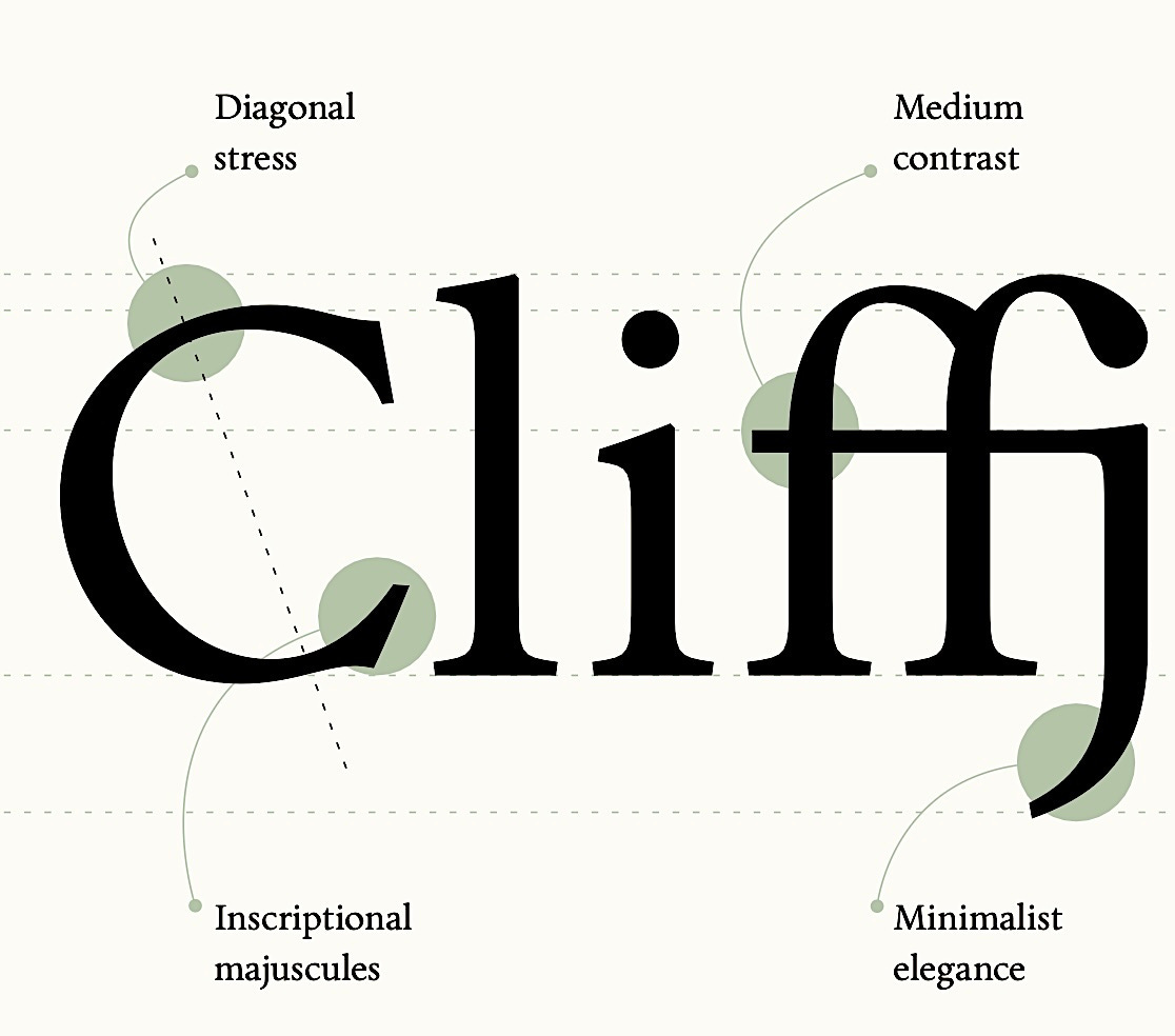
Chora
Niche Font
My 12-year old recently suprised me at supper by innocently asking, out of the blue, whether there could exist anything worse than Comic Sans. This started a wide-ranging discussion, touching on whether Palatino was nauseating and Arial morally bankrupt (yes to both). I thought I had kept my typeface fetish pretty quiet but had not reckoned with genetics. My mother studied type design with Adrian Frutiger. As a child I spent hours leafing through Deberny & Peignot type books, which alone sets me firmly on the spectrum. And now the third generation picks up the torch.
Like most people my age, I have never quite recovered from seeing for the first time a page set in Times Roman come out of a laser printer. I was like Mr. Jourdain in Molière’s Bourgeois Gentilhomme. Anxious about his lack of talent for poetry, he is overjoyed to learn that he has in fact been writing prose all his life. The transmutation of humble words into dignified text was a miracle which has never stopped, and continues as I type this in a handsome serif typeface—no choice there1—on Substack. Our guides were set in Minion, at my insistence.
My political leanings are extreme center, which is another way of saying à la carte, and I now realize that this irresolution shows itself in my choice of computer fonts. Politically speaking, sans serifs are progressive and serifs are conservative. There is a lot of ideology in a font. The fact that serifs are more readable in small sizes can be considered an unpleasant law of famously right-wing Nature. Conversely, the rise of Helvetica is a sign of the progress of the benignant, redistributive State. Sans serifs always risk pandering; serifs always flirt with argument from authority.
This leaves open the thorniest questions of all. Which serif? Which sans? The search for the perfect sans can turn into a fever dream. Having lived in Switzerland, I am vaccinated against Helvetica, but all the alternatives seem to have mannerisms akin to speech accents that eventually grate. Frutiger is prissy, Nunito wears a black turtleneck and says pree-sentation, Casper is too dad-of-the-month, etc. In the end, one is forced to retreat into grim options like Calibri, which my daughter hates with a passion though without offering alternatives.
On the serif side, the sunny, calm, warm voice of Garamond is hard to beat, one of those moments of artistic perfection like 1970s Pininfarina Ferraris, from which it is hard to go anywhere but down. Hard, but not impossible. I have mentioned Minion, a masterpiece of legibility achieved, as in a voice able to cut through a crowd, via a slight harshness. Minion in very large sizes looks nasal, and you can’t easily unhear that. Which is why when, in that ocean of Canadian-grade blandness that is my Bluesky timeline, I saw a post about the Chora typeface, I stopped in my tracks.
Reader, I bought the typeface (€44). It is the work of Patrick Nell, and he describes it as a Viennese Book Type. I emailed the sample sheet to my reader and Arbiter of All Type, Bill Troop, and he looked upon it favorably. Before you judge such a purchase frivolous, consider that many of you who seek unique perfumes at four times that price are otherwise content for your documents to wear Blue Stratos (Arial) or Hai Karate (Times New Roman). Because a pdf contains all the necessary type info, my letters and grant applications will henceforth have the sillage of something akin to that other Wiener Wunder, Knize Ten.
Now there is! Nice choice of typefaces.


I'm much too hyped about this post to say anything clever, so here are some thoughts in random order:
“Niche font” is the single best quote I could have hoped for to put on my new foundry website (give me a couple of weeks).
A text set in Minion is extremely readable. I hope they never discontinue this fragra… typeface. (I must say, Minion 3 is a successful reformulation.)
I’ve read the guides, watched the scientific lectures, seen the YouTube reviews while they were still online. I was a fan of Luca Turin even before knowing about the typeface fetish. Or the mother. Or the daughter.
The Deberny & Peignot specimens are fantastic.
Regards also to Bill Troop—Semplicita Pro, his version of the Nebiolo type, is the reason I never attempted a geometric–humanist sans hybrid. It had already said it all. Fantastic.
Knize is on the way home, but today the scent is Terralba by Delphine Thierry.
A passing comment: the old Serge Lutens branding used the Nicolas-Cochin typeface - it always felt so perfect for the brand and its mysticisms.