I'm much too hyped about this post to say anything clever, so here are some thoughts in random order:
“Niche font” is the single best quote I could have hoped for to put on my new foundry website (give me a couple of weeks).
A text set in Minion is extremely readable. I hope they never discontinue this fragra… typeface. (I must say, Minion 3 is a successful reformulation.)
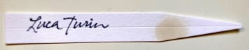
I’ve read the guides, watched the scientific lectures, seen the YouTube reviews while they were still online. I was a fan of Luca Turin even before knowing about the typeface fetish. Or the mother. Or the daughter.
The Deberny & Peignot specimens are fantastic.
Regards also to Bill Troop—Semplicita Pro, his version of the Nebiolo type, is the reason I never attempted a geometric–humanist sans hybrid. It had already said it all. Fantastic.
Knize is on the way home, but today the scent is Terralba by Delphine Thierry.
Based on my own experience, the fact that no publisher has yet commissioned a book about fonts WRITTEN FOR CHILDREN seems inexplicable. Fonts strike me as a natural topic to obsess over after learning the alphabet and learning to read. As a kid I was always baffled why the same letters could look so very different in different places, and why my own print and script could never approach the serene perfection of Helvetica on a box of Lego bricks, Highway Gothic on Long Island road signage, or Century Schoolbook in the classroom.
You struck straight in my heart, but in a good way. I worked for about five years as an almost pioneering page layout artist, minus the artist, because I always cared way more about the font than the images. I agree with you: Garamond is always the best, at least if you work with Office and you cannot choose Chora or Minion…
Yes but which Garamond? They are all different. One of the great legal embarrassments in typeface litigation occurred when Adobe sued a font cloner, and their expert witness (I think it was Slimbach?) could not identify which Garamond was which when asked on the stand. If it was Slimbach he must have been rattled. He definitely knows the variations of that font as well as anyone.
I guess that the one that my pc app proposes is the legit one… but anyway, that reminds me of the day when Roberto Cavalli was shown two pairs of pants on tv and was asked which was the ones he designed. Obviously, he picked the counterfeit ones.
That is a great anecdote about Cavalli! The WSJ recently had a story on high end handbag fakes - - quite expensive fakes, which are so close to the originals that you may need an x-ray machine to tell if they are fake. It's a constant issue in typeface manufacturing.
To detour into the works of the late Sig. Cavalli, for a moment…
I am writing this from Moorfields Eye Hospital A&E, where I am receiving treatment for severe ocular trauma (caused by a chance encounter with an image of one of his ‘patchwork leopard-print robes’). I won’t upload the image, as I’m certain it would constitute assault.
Optima is one of the very greatest typefaces, an unbelievable meeting of the craftsman with the time. (Palatino and its bookish sister Altus, by contrast were looking back in time by several centuries.) It is still one of the greatest and most contemporary looking typefaces, so many decades later. It has some precedents but no successors and no good imitators. Zapf did it so well that type designers have been forced to leave it alone.
By the way sorry, autocorrect got me: the sister of Palatino is Aldus, not Altus. Zapf (very stubbornly) believed that Palatino was a display face and that Aldus should be used for book work. Aldus is very similar, but with longer descenders and ascenders. It's amazing how much difference that makes. It looks elegant and remote and not at all like Palatino, yet it really is Palatino except with smaller x-height. There are also variants of Palatino like 'Palatino Small' and 'Palatino 1950' that are worth looking it. Finally there is a typeface little used called 'Zapf Renaissance' and that is Zapf's own perfected version of Palatino.
That's very good! Reminds me that as a child my father was reading Churchwards 'Lost Continent of Mu'. Touching, ain't it? I am trying to process your idea of Optima and archaism - - can you go into a little more detail?
I keep saying to myself, “You don’t always need to leave a comment.” But then I read these inexplicably perfectly-tailored posts and can’t resist!
First, Chora is fantastic. Well worth the splurge, if it could even be considered that. Congrats!
As a kid I had a typewriter with interchangeable font wheels and the quotation marks were always just the two vertical marks, so I’d take my piece of paper and turn it upside down again and again to the get the commas to line up as “curved quotes” to match the ones in my books. Yes, we are a special bunch.
My most recent observation is Caslon, which The New Yorker Magazine uses and which I really love. But the bulbous top on the 8, that’s wider than the bottom, stops me each time I see it, as it looks upside down.
Another weird one for you… while I’m not a huge Palatino fan either, in the 80s, Palatino in my school books had a different lowercase y. Instead of starting with the standard flat serif, it began with the same curve that the current upper case Y starts with, but even more rounded. I never see it but I’m always on the lookout.
Thank you for this insanely satisfying and unexpected read!
Thank you so much for taking the trouble to write! This post, written in a tearing hurry, seems to have resonated in an unexpected way. I love Substack!
My favourite, readable font is the original Bembo; I find it comforting like a mug of tea. Galahad is a bit exotic and the font I have used for my business cards, all smooth curves. I look forward to reading an article set in Chora...
Thanks for sharing Chora. It's new to me and, at first glance, quite nice. I have a long-standing thing for the Museo family, which includes both serif and sans variants.
Ha, ha. I'm doing much more UX now where I'm mostly using a specific screen font in all of my work so Museo is now relegated to my sporadic personal projects. I'll need to check out Calluna.
Love Garamond and Baskerville. Hate that so many Wordpress type faces are either bland or offensive. Think Palatino is boring but ok for legibility. Like Gill Sans but not as much as before it became so ubiquitous. Helvetica is brilliant but ultra-corporate. My favourite is Mrs Eaves.
Mrs Eaves has improved with age. It was very badly fitted at first, but finally after much ridicule, particularly by me, it was revised to be usable. It is a great design, one of Licko's very best. It isn't easy to take a face like Baskerville and so beautifully re-imagine it in contemporary graphic terms, but that is what she did. As such it is never been equalled.
You are obviously a typographer and far better informed than me. (I worked for Lou Klein, head of graphic design at the RCA for many years.) It is very interesting to read about Mrs Eaves' evolution. Thank you.
Love this post and thanks for the mention! I would only add that you could argue that legibility at small sizes is a matter less of the design itself than of the implementation of the design. Most typefaces are optimized for 12 points. Any 12 point design can be optimized for 6 points by: 1, increasing the x-height, 2, widening the shapes by 10-20%, 3, Increasing the stroke weight by 10-30%, 4, increasing the spacing between letters, 5, lowering the contrast by increasing the weight of the thinnest features. Also the exception to the rule: Matthew Carter usually optimizes his text typefaces for 9 rather than 12 points, and, correspondingly, his main stroke widths will not be the common 60 units but more like 80 or even 90 units. He likes a meaty look on the page, as was common in letterpress printing before let us say 1980. Regarding Minion, i remember Slimbach saying in the 90s that he now considered it too cool and clinical - - but it really is a great workhorse, as he intended.
Well after reading all the very thoughtful comments, I hesitate but… When I looked at your post initially without my glasses I read the title as Charms, which immediately gave me a scent memory of Luck Charms which I had for breakfast as a child (and yes, they really were magically delicious!). But then I read your post - no marshmallow stars - and it got me thinking about fonts used for cereals and other foods. Anyway, great fun reading everyone’s comments and thank you for such a fun post and the wonderful scent memory!
I used to pore over the Lettraset book when I was in design classes a million years ago. We were expected in some classes to be able to do a serif or sans by hand and on demand in at least one class.
I'm reading the 2018 guide now and it is a joy! Knowing more about the type is fantastic.
An aside--in the guide you talk about Italian perfumery and the work being done, have you encountered Nobile 1942? Patchouli Nobile is probably my favorite, it's like vintage Polo Green and Borneo 1834 had a baby. Sounds ghastly on paper but divine on skin.


I'm much too hyped about this post to say anything clever, so here are some thoughts in random order:
“Niche font” is the single best quote I could have hoped for to put on my new foundry website (give me a couple of weeks).
A text set in Minion is extremely readable. I hope they never discontinue this fragra… typeface. (I must say, Minion 3 is a successful reformulation.)
I’ve read the guides, watched the scientific lectures, seen the YouTube reviews while they were still online. I was a fan of Luca Turin even before knowing about the typeface fetish. Or the mother. Or the daughter.
The Deberny & Peignot specimens are fantastic.
Regards also to Bill Troop—Semplicita Pro, his version of the Nebiolo type, is the reason I never attempted a geometric–humanist sans hybrid. It had already said it all. Fantastic.
Knize is on the way home, but today the scent is Terralba by Delphine Thierry.
Dear God. You have just made my day, week and month. I have tears in my eyes.
A passing comment: the old Serge Lutens branding used the Nicolas-Cochin typeface - it always felt so perfect for the brand and its mysticisms.
Et tu, Liame...
It's interesting that this very period typeface has stayed in use for over a hundred years. There is steel beneath the velvet!
Oh my God, THIS topic.
Based on my own experience, the fact that no publisher has yet commissioned a book about fonts WRITTEN FOR CHILDREN seems inexplicable. Fonts strike me as a natural topic to obsess over after learning the alphabet and learning to read. As a kid I was always baffled why the same letters could look so very different in different places, and why my own print and script could never approach the serene perfection of Helvetica on a box of Lego bricks, Highway Gothic on Long Island road signage, or Century Schoolbook in the classroom.
You struck straight in my heart, but in a good way. I worked for about five years as an almost pioneering page layout artist, minus the artist, because I always cared way more about the font than the images. I agree with you: Garamond is always the best, at least if you work with Office and you cannot choose Chora or Minion…
Yes but which Garamond? They are all different. One of the great legal embarrassments in typeface litigation occurred when Adobe sued a font cloner, and their expert witness (I think it was Slimbach?) could not identify which Garamond was which when asked on the stand. If it was Slimbach he must have been rattled. He definitely knows the variations of that font as well as anyone.
I guess that the one that my pc app proposes is the legit one… but anyway, that reminds me of the day when Roberto Cavalli was shown two pairs of pants on tv and was asked which was the ones he designed. Obviously, he picked the counterfeit ones.
That is a great anecdote about Cavalli! The WSJ recently had a story on high end handbag fakes - - quite expensive fakes, which are so close to the originals that you may need an x-ray machine to tell if they are fake. It's a constant issue in typeface manufacturing.
To detour into the works of the late Sig. Cavalli, for a moment…
I am writing this from Moorfields Eye Hospital A&E, where I am receiving treatment for severe ocular trauma (caused by a chance encounter with an image of one of his ‘patchwork leopard-print robes’). I won’t upload the image, as I’m certain it would constitute assault.
I just realised that if you Google a particular font, the search results come up using that font!
Ha!!!!! I had no idea.
Really?!
I never knew that. It depends on the font, evidently. I find it working for Garamond but not for Palatino.
If you’re a centrist, why not use one of the great sort-of-serif, sort-of-sans typefaces of all time: Optima.
I actually always loved Optima, but was afraid to say so in public. Now look what you've done.
Optima is one of the very greatest typefaces, an unbelievable meeting of the craftsman with the time. (Palatino and its bookish sister Altus, by contrast were looking back in time by several centuries.) It is still one of the greatest and most contemporary looking typefaces, so many decades later. It has some precedents but no successors and no good imitators. Zapf did it so well that type designers have been forced to leave it alone.
By the way sorry, autocorrect got me: the sister of Palatino is Aldus, not Altus. Zapf (very stubbornly) believed that Palatino was a display face and that Aldus should be used for book work. Aldus is very similar, but with longer descenders and ascenders. It's amazing how much difference that makes. It looks elegant and remote and not at all like Palatino, yet it really is Palatino except with smaller x-height. There are also variants of Palatino like 'Palatino Small' and 'Palatino 1950' that are worth looking it. Finally there is a typeface little used called 'Zapf Renaissance' and that is Zapf's own perfected version of Palatino.
I really like the characterization of Optima as centrist!
I see it as the typeface of Atlantis, an archaic future.
That's very good! Reminds me that as a child my father was reading Churchwards 'Lost Continent of Mu'. Touching, ain't it? I am trying to process your idea of Optima and archaism - - can you go into a little more detail?
A chisel can cut serifs in stone. But only some Atlantean power laser could have carved Optima's lissom tapers.
I keep saying to myself, “You don’t always need to leave a comment.” But then I read these inexplicably perfectly-tailored posts and can’t resist!
First, Chora is fantastic. Well worth the splurge, if it could even be considered that. Congrats!
As a kid I had a typewriter with interchangeable font wheels and the quotation marks were always just the two vertical marks, so I’d take my piece of paper and turn it upside down again and again to the get the commas to line up as “curved quotes” to match the ones in my books. Yes, we are a special bunch.
My most recent observation is Caslon, which The New Yorker Magazine uses and which I really love. But the bulbous top on the 8, that’s wider than the bottom, stops me each time I see it, as it looks upside down.
Another weird one for you… while I’m not a huge Palatino fan either, in the 80s, Palatino in my school books had a different lowercase y. Instead of starting with the standard flat serif, it began with the same curve that the current upper case Y starts with, but even more rounded. I never see it but I’m always on the lookout.
Thank you for this insanely satisfying and unexpected read!
Thank you so much for taking the trouble to write! This post, written in a tearing hurry, seems to have resonated in an unexpected way. I love Substack!
My favourite, readable font is the original Bembo; I find it comforting like a mug of tea. Galahad is a bit exotic and the font I have used for my business cards, all smooth curves. I look forward to reading an article set in Chora...
Is it not the little things?
Especially with type!
Thanks for sharing Chora. It's new to me and, at first glance, quite nice. I have a long-standing thing for the Museo family, which includes both serif and sans variants.
Using Jos Buivenga’s Museo and Calluna quite a lot in my graphic design work!
Ha, ha. I'm doing much more UX now where I'm mostly using a specific screen font in all of my work so Museo is now relegated to my sporadic personal projects. I'll need to check out Calluna.
Love Garamond and Baskerville. Hate that so many Wordpress type faces are either bland or offensive. Think Palatino is boring but ok for legibility. Like Gill Sans but not as much as before it became so ubiquitous. Helvetica is brilliant but ultra-corporate. My favourite is Mrs Eaves.
Mrs Eaves has improved with age. It was very badly fitted at first, but finally after much ridicule, particularly by me, it was revised to be usable. It is a great design, one of Licko's very best. It isn't easy to take a face like Baskerville and so beautifully re-imagine it in contemporary graphic terms, but that is what she did. As such it is never been equalled.
You are obviously a typographer and far better informed than me. (I worked for Lou Klein, head of graphic design at the RCA for many years.) It is very interesting to read about Mrs Eaves' evolution. Thank you.
Love this post and thanks for the mention! I would only add that you could argue that legibility at small sizes is a matter less of the design itself than of the implementation of the design. Most typefaces are optimized for 12 points. Any 12 point design can be optimized for 6 points by: 1, increasing the x-height, 2, widening the shapes by 10-20%, 3, Increasing the stroke weight by 10-30%, 4, increasing the spacing between letters, 5, lowering the contrast by increasing the weight of the thinnest features. Also the exception to the rule: Matthew Carter usually optimizes his text typefaces for 9 rather than 12 points, and, correspondingly, his main stroke widths will not be the common 60 units but more like 80 or even 90 units. He likes a meaty look on the page, as was common in letterpress printing before let us say 1980. Regarding Minion, i remember Slimbach saying in the 90s that he now considered it too cool and clinical - - but it really is a great workhorse, as he intended.
I will revisit this Substack over and over, what a joy. As a kid, I would study my artist mother's Letraset catalogs. I feel like I'm among my people.
Well after reading all the very thoughtful comments, I hesitate but… When I looked at your post initially without my glasses I read the title as Charms, which immediately gave me a scent memory of Luck Charms which I had for breakfast as a child (and yes, they really were magically delicious!). But then I read your post - no marshmallow stars - and it got me thinking about fonts used for cereals and other foods. Anyway, great fun reading everyone’s comments and thank you for such a fun post and the wonderful scent memory!
I used to pore over the Lettraset book when I was in design classes a million years ago. We were expected in some classes to be able to do a serif or sans by hand and on demand in at least one class.
I'm reading the 2018 guide now and it is a joy! Knowing more about the type is fantastic.
An aside--in the guide you talk about Italian perfumery and the work being done, have you encountered Nobile 1942? Patchouli Nobile is probably my favorite, it's like vintage Polo Green and Borneo 1834 had a baby. Sounds ghastly on paper but divine on skin.
I've always been partial to Garamond myself.